Boston’s great office-to-residential conversion train is picking up momentum and adding new buildings regularly. Some of these structures are not historical and have no architectural significance. In fact, the conversions may improve their appearance.
Boston being an historic city, however, you can’t throw a Dunkin donut without hitting something that has either a historical record or an architecture of note. In some cases, though, they look historic but simply fit in well with Boston’s red brick or granite structures of note.
Once again, the Financial District scores the most residential conversions, a trend that will bring life back to the area, particularly on nights and weekends. With life comes industry. The salad bars, sandwich places, coffee shops, dry cleaners and other businesses that once served workers in banks, insurance companies, and investment firms will now profit from full-time residents.
Here are the four latest Boston office-to-residential conversions to be announced. Photos are taken from real-estate listings.
Financial District Conversions
51 – 55 Franklin Street:
I don’t have all the details on this one yet as the building just sold for $4.625 million, but the 30,000 sq ft office space is expected to be turned into housing. The real estate listing says it has central air and heating, ample natural light, and off-street parking. I will have more information as it becomes available.
150 Milk Street:
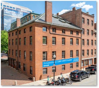 The project will convert a partially occupied historic office building in the Financial District into a residential community. It will hold approximately 18 new rental, multifamily dwelling units from floors two through five. The ground floor will be reconfigured to include a residential lobby enhanced by a second-floor tenant amenity space.
A mix of office and/or retail uses will occupy the street level and contribute to the area’s evolving mixed-use neighborhood. These residences will draw businesses and services into an area that was overwhelmingly commercial.
4 Liberty Square:
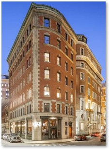 The proposed project will renovate the +-25,000- square foot , seven-story office building located prominently on Liberty Square at the corner of Batterymarch & Water Streets. The proposed plans call for the existing office space on floors two to seven to be converted to 36 new apartment units that will include 30 studios, one one-bedroom and five two-bedroom apartments.
Although the renovation will not incorporate parking spaces it will offer an interior, subsurface, bicycle storage room with 36 resident bike parking spaces. The building is only two blocks from Leventhal Park in Post Office Square. The ground level will continue to hold the existing restaurant or retail businesses.
South Boston Conversion
69 A Street:
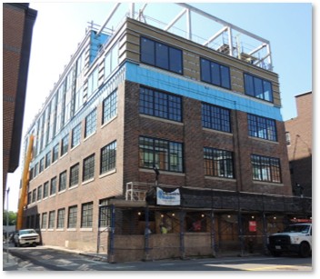 Floors two through four of the existing building will change from approved office use to multifamily residential use.
The proposed conversion will create twenty-four residential units specifically for participants in the Council on International Educational Exchange’s international internship programs.
Other than the interior modifications, there will be no significant alterations to the building’s exterior appearance, height, or footprint. This structure is notable because it is Boston’s first cross-laminated timber (CLT) project. Ground-level retail and fitness space on the lower levels will remain along with an on-site garage containing 18 parking spaces.
Downtown Conversion
15 Court Square:
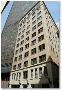 This 11-story office building on the edge of the Financial District will be converted to 80 rental units. These residences will comprise all floors above the existing ground level and lower level retail spaces. No off-street parking will be provided.
The building went up in 1922 and was renovated in 2018. The apartments will be in easy walking distance of the Government Center T-Stop, as well as the State station, carrying the Blue, Green, and Orange Lines.
Photos of the building’s current interior can be found on LoopNet here.