“A picture is worth a thousand words.”
In yesterday’s post I noted that our Presidential candidates use only one of the four learning types in their campaign talk. That is, they just talk.
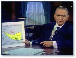
The only time a Presidential candidate actually used visual aids was in 1992 when Ross Perot employed them to demonstrate his position on the future of the economy and the growth of the national debt. He spoke directly to the American people and showed us his point with actual graphics.
That meant he used two unusual and innovative approaches: (1) he bypassed the news media, commentators, and pundits who historically interpreted the candidates’ messages for us ordinary folks, and (2) he showed voters what he was talking about using charts and graphs that they could see and understand. Those pictures saved him thousands of words and spoke volumes to us Visual Learners.
What Ross Perot Forgot
But Ross Perot forgot one thing: those who hold power will attack anyone who threatens it.
Hindsight tells us that the reaction to his Visual Learner approach was predictable. The media laughed him off the stage. The press jealously guarded its position as intermediary, using their wisdom and experience to tell the public what to believe. Seeing a threat to their primacy and importance, the commentators and anchor men employed mockery to denigrate both Ross Perot and his new style of communication. The media could not tolerate that his clearly understandable charts, graphs, and illustrations would enable the American public to better understand what Mr. Perot was saying. That meant voters could make up their own minds without benefit of media advice and the wisdom of pundits.
The media did their best to ensure that Ross Perot’s approach never raised its visual head again. They presented the use of visual aids as risible and ridiculous. The public picked up on this mockery and accepted it.
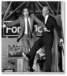
Ross Perot and his charts and graphs became a joke in the same way President Gerald Ford, a star athlete and graduate of Yale Law School, morphed into a stumbling idiot when Chevy Chase ridiculed him on Saturday Night Live. Laughter has a long life and its use on Ross Perot’s charts forever tarred visual aids in a Presidential campaign.
Seeing, Not Just Hearing Campaign Talk
This is ludicrous, people. I find nothing wrong with a candidate using visual aids to reinforce the point by reaching out to Visual Learners who grasp best what we see. There is, for that matter, nothing wrong with actually seeing the information instead of just hearing words piled on top of words.
Ironically enough, social media has become the new Ross Perot, providing us with both visual aids and a direct medium of communication between candidates and voters. Facebook, Twitter, Pinterest, and other sites offer an abundance of such things. You can find charts, graphs and maps on almost any topic quite easily. Although this mechanism could not have been imagined in 1992, it has become very powerful.
Even so, the fact that these graphics are not directly connected to a campaign lessens their impact. And even when the campaigns post graphics on their websites they lose effectiveness because (1) You have to be online to see them; (2) You have to be connected to the right sources to see them; and (3) You have to match them to the candidate yourself. How silly is that? I know many well-educated, well-informed and concerned voters who, for whatever reason, just don’t go online for anything but email.
Overcoming the Ross Perot Effect
Why should a candidate not stand up in front of an audience and say, the economy was better under Administration B and here’s the chart that proves it? Why can’t a candidate claim that costs will be less with his proposed program and here’s the graph that shows the crossover point? When will a candidate have the guts to overcome the Ross Perot Effect and show a pie chart that indicates how much better a situation will be when her proposal is implemented?
This is 2016, not 1816 and it’s past time to consign the Ross Perot Effect to the trash dump of history. Some of us actually like visual aids and learn better from them than from the endless blah-blah-blah of the current Presidential campaigns. After all, social media won by backing the traditional news media into a corner and bludgeoning their profit models.
As a result, the news media have adopted a whole new attitude. Today they report on Tweets, as if those were actual newsworthy events instead of 140-character silliness that would vanish like fog in sunlight without ink and air time.
It’s time, people. Let’s actually see some campaign information instead of just hearing about it. We may not be able to eliminate the blah, blah, blah and yada, yada, yada of a Presidential campaign but candidates can certainly make their positions more interesting and easier to understand. Go for the graph!


